Monday, December 5, 2011

2009 Station Fire Report and Maps

Hypothesis: Fire will generally stay in high elevation areas because there is more wind in the upper atmosphere.
Report:
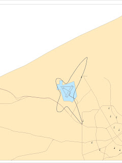
     Using information from the USGS Seamless website I was able to obtain the DEM (Digital Elevation Model) of LA county. Also, I download the perimeter of the fire as projected shape-files from the LA County Enterprise GIS website. By using both raster and vector elements on the same map projection (the theme map), I was able to show both the elevation and the spread of the fire. The darker the greener parts were, the higher elevation was, while the darker the red colors were the lower the elevation. The color white separated the two levels of elevation.
     The Reference map on the bottom right of the picture shows the all of LA county. The important features include the pinpoint of the fire (which unfortunately is too small to see because the map is pixelated). The information of exact spot was found by using the GeoMAC website (which also has precise information of historical fires). The GIS at UCLA: Mapshare DB website also provided shape files such as the Los Angeles National Forest, populated areas, the major roads, rivers, and bodies of water.
     I was only technically correct in my hypothesis about the elevation. Other aspects must be taken into account. My overall hypothesis turned out to be wrong. Although the fire did generally stay in higher elevation, there was a general line in the fire perimeter that implies that it would have definitely spread into the valley if it hadn't been contained. Thus, the fire department prevented it from getting too far into into the city limits. This means there is no correlation between the fire and the elevation it is in. Unfortunately, the main reasons the fire spread was because poor communication among other "major errors by fire officials helped to create the biggest fire in Los Angeles County history," (Stewart, LA Weekly). This left most of the Big Tujunga Canyon to be burnt.
     However a new hypothesis can be formed by using information on vegetation and the reference map of L.A. county under the larger theme map. Since the reference map includes the Los Angeles National Forest (the large green area near the center of the map), it would be more accurate in estimating where and how the fire would spread. It's safe to assume that the only reason the fire stayed in a higher elevation was because the fire was spreading throughout the dry forest, the majority of which just so happened to be in the mountains.
     My overall experience with the project has been a good one, however difficult it was in the past. It gradually got easier and the more I explored the programs like ArcMap and ArcCatalog. Learning how to use all these different ArcGIS programs as well as how to incorporate government information from free government website in order to project visual theme maps is a good skill to learn. Since theme maps have a variety of different uses like advertising, marketing, demographic studies, and even vegetation research, it's good to know that they can be also be used in emergencies such as natural disasters. It's good to be able to know such a useful tool and to be able to put it into practice.
Bibliography


Cal Fire - Incidents, <http://cdfdata.fire.ca.gov/incidents/incidents_details_info?incident_id=377>


GeoMAC, <http://www.geomac.gov/geomac_classic/viewer.htm>


GIS at UCLA: Mapshare DB, <http://gis.ats.ucla.edu//Mapshare/Default.cfm>


Stewart, Jill. "Did Feds Cause the Station-fire Disaster - Page 1 - News - Los Angeles - LA Weekly." Los 
     Angeles News, Events, Restaurants, Music LA Weekly. LA Weekly, 07 Oct. 2009. Web. 02 Dec. 
     2011. <http://www.laweekly.com/2009-10-08/news/did-feds-cause-the-station-fire-disaster/>.


The National Map Seamless Viewer, <http://seamless.usgs.gov/website/seamless/viewer.htm>

Sunday, November 20, 2011

Racial Maps and Comments


The above map is a color represented percentage of 'Some Other Population' in the census website (www.census.gov) in the year 2000. Although the census map doesn't specify which which racial category it actually is, it is most likely that of Hispanics. Unfortunately, I wasn't able to make the key for this map describing how much population is within each individual color, and the same goes for the rest of the following maps. However, it is safe to say that the darker the colors are, the more densely populated the areas are. In this map, the darkest color is the purple and it shows that the more populated areas are in the southwest.
This second map is another colored map representing the estimated Asian population in the U.S in the year 2000 taken from information from the same census website mentioned above. Again the darkest colors (in this case, the darkest blue) are the most densely populated areas. Here, it is easy to tell that of the many general areas of concentrated Asian populations, the most lies in the southwest coast. The single most densely populated area is the San Francisco bay area in the western coast in California. Other regions include the northwestern coast, Florida, and the New England area (the northeast coast).

(Correction: the grey area in the middle is actually a zoomed out version of the 'Some Other Population Alone' map left 'visible' when the map was saved as a jpeg image).
Here is the black population in the year 2000 according to the census website in another color represented map. Unfortunately, an unknown problem in the Arcmap GIS program kept the map from appearing in the 'layout view.' Here, the darkest colors are again the most populated regions and that appears to be in the southeast region of the U.S.

Census map series here could have been slightly better with a few touch ups, but generally the necessary information is shown. The maps show that population can vary drastically among regions and that stereotypical assumptions can be proven wrong when the surveyed information can be put into a map. My overall impression of GIS is actually that of impressed how easy it could be. With a good amount of time one would be able to get a real grasp on the program. I actually thought it would be harder. With that said, I do admit it was difficult. However, the basic concept can become familiar (with practice) and even become exciting depending on the type of information being dealt with.

Tuesday, November 8, 2011

Northern Grand Canyon (Week 7 Lab)

I selected a section of the Northern Grand Canyon in Arizona, U.S. because, it not only has great features in terms of varying elevation (cliffs, peaks, and small valleys), it's easily recognizable as one of the most well known features on the Earth. Digital Elevation Models have a large scale of uses. These programs can be used for studying habitats. This could help scientists get a good idea of the kind of wildlife that could live within the area. They can also be used to study vegetation, and in this particular case the elevation could answer why plants are scarce in the Grand Canyon. Animal migrations can be studied through this because the elevation differences in the land can imply the future temperatures in the area in different seasons. The program could also be useful as references for natural disasters. Such as the effects of a flash flood (which would be very interesting in this particular area), the possibility of a tornado (which would be pretty low in the grand canyon), and the changes in seismic activity (for example: if a magma chamber existed underground, it would create changes in elevation in the land above it like Yellowstone National Park).
The GCS (Geographic Coordinate System): GCS_North American_1983 is the spatial reference.
The Extent Information in (Decimal Degrees)
- Top: 36.5247222215
- Left: -112.557777777
- Right: -111.819722221
- Bottom: 36.0538888881


Sunday, November 6, 2011

Six Map Layers and the Significance of Map Projections

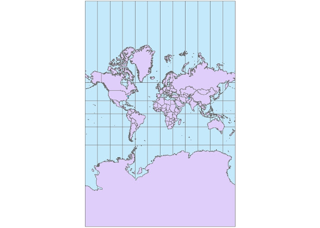
Mercator Map (Conformal)
Two Point Equidistant
Cylindrical Equal Area
Equidistant Cylindrical
Pole Lambert Azimuthal Equal Area
World Stereographic (Conformal)

     There are various types of map projections. Some can look like a realistic view of the earth from space while others shape the earth in ways that make it completely unrecognizable. Each projection has its own distinct properties and therefore they have their own functions.
     Certain maps are better for navigation. Specifically the conformal types of maps. These maps have lines that are the incidental. Meaning they have parallel line that keep the shape of the earth more or less accurate. Conformal types of maps are also known as orthomorphic map projections. The Mercator projection and the Stereographic projections are both conformal and although they don't keep the exact shape of large objects like the continents (especially Africa) they have a consistent direction throughout all points on the map. The Mercator projection is even used for marine navigation.
     There are more Equidistant maps than other types of map projections. Equidistant maps have certain uses that rely more on proportionate distances rather than actual angles. They always keep the scale consistent. These projections are large scale and are mostly used for air travel, like the equidistant cylindrical map projection above.
     Equal Area maps are mostly used for geology mostly because they (you guessed it) preserve area. They correct the mistake of the Mercator projection that shows Greenland a few times larger than it should be, making it larger than Africa. For example: the Equidistant Cylindrical (shown above) clearly shows the difference in size between Greenland and Africa. Map projections are generally important because they let us understand our positions in the earth at any given point not only through visuals but through mathematical analysis (making us albe to navigate ourselves accurately)


Sunday, October 30, 2011

My ArcMap Experience

     My personal ArcMap experience wasn't pleasant. Unfortunately, I didn't get far into the tutorial (not even to exercise 2) because I kept on getting stuck on what seemed to be the simplest things. My apologies, my map remains unfinished. Either the ArcMap tutorial wasn't clear enough on the instructions or I simply couldn't wrap my head around the convoluted software program, (I think both). I'm not exactly anywhere near the term "computer wiz" and certain ideas don't click for me the way they do for others.
     Also, the tutorial seemed to be more for a person who was either already computer savvy or for a person who had more time to explore the program. (My schedule conflicted with the free computer labs hours therefore I didn't have as much time to get a real hands on experience with the program). Even tough my experience on the tutorial wasn't particularly fantastic, I did find certain things interesting though. The fact that text can be inserted pretty much anywhere on the page at the click of a symbol was nice. I also liked how there could be a different symbol for various buildings or specific points on the map.
     There is a lot of potential for the programmers and mapmakers in the field of GIS because ArcMap, along with several other software and programs, have various features and options that go into developing a digital map. And since there are about as many definitions of GIS as there are people working on computer maps of any kind, this field has the ability to expand on a much wider basis.
     However, a potential pitfall in the field of GIS is that the programs and software used to make such maps can be complicated and too difficult to understand for a person who has no background on any kind of GIS programs relating to it. A simple way of making a program more easy to understand is to make the instructions as visual as possible. The software can come with a video tutorial (similar google mymaps) that doesn't skip steps. Easy to use and crysal clear visual instructions will definitely make the programs more hospitable for new users.


Monday, October 17, 2011


View Titanic's Maiden Voyage in a larger map

http://maps.google.com/maps/ms?hl=en&gl=us&ie=UTF8&oe=UTF8&msa=0&msid=207599391696628191135.0004aef79b1fd425a541b

Neogeography has many things going for it in this information age. Data is being collected all the time by average people. From what I've read, companies are actually paying users to take detailed pictures of buildings, streets, and other places to help the company on their projects. The level of detail that can be obtained will help many users know exactly where they stand in the world.

The only negative sides I can think of about Neogeography is that, even though it's paving the way for a new form of global centralization, it's making normal paper maps more obsolete and that it's up against privacy issues every now and then. In a matter of years no one will be able to read a USGS topographic map (even though it's not like everyone used to anyway) that the average public will be completely dependent on computers in another area once again. I'm just saying if something happens to the earth that wipes out all computers no one will be able to tell where they stand in the world. My second point is that Google Streetview is an example of an invasion of privacy because it's 3-dimensional view uses pictures taken at a certain time, that includes people and cars. That means a random user can view someone who was caught in the series of pictures (creepy much?) or they can read someones license plate, among other things.

Apparently the pros outweigh the cons when it comes to Neogeography because these it can come in handy in natural disasters and save people's lives. Neogeography can help the world in a lot of ways; from helping companies make good geographically related choices and contribute to the economy, helping a government official know where the poverty levels are most prominent by means of a poverty related map, to assisting a lost person in a forest by means of GPS. At least industries and corporations realize that the benefits of neogeography far outweigh the costs of a few privacy issues.

Sunday, October 9, 2011

Lab 2: USGS Topographic Maps

1.) Beverly Hills Quadrangle, California-Los Angeles Co.
2.) Beverly Hills Ca.
3.) The quadrangle was first creted in 1995.
4.) North American Datum of 1927 (NAD 27) and North American Datum of 1983 (NAD 83).
5.) The scale of the map is 1:24,000.
6.  a.) 5 centimeters on the map is equivalent to 120 meters on the ground.
     b.) 5 inches on the map is equivalent to 1.893 miles on the ground.
     c.) 1 mile on the ground is equivalent to 2.64 inches on the map.
     d.) 3 kilometers on the ground is equivalent to 12.498 centimeters on the map.
7.) The contour interval on the map is 20 feet.

9. a.) Elevation: Greystone Mansion (in Greystone Park) = ranges from approx. 580 to 540 feet/176.784 to 164.592 meters.
    b.) Elevation: Woodland Cemetery = approx. 140 feet/42.672 meters.
    c.) Elevation: Crestwood Hills Park = ranges from approx. 600 to 880  feet/182.88 to 268.224 meters.
10.) Universal Transverse Mercator, zone 11.
11.) the UTM coordinates for the lower left corner of the map are ³7 63, ³62.
12.) 1,000 meter increments between UTM lines translates into 1,000,000 square meters.
13.) This is a rough estimation for the elevation levels among the UTM grid lines.


Elevation Measurements from West to East Along UTM Northing  3771000 (in rough increments of 20 feet):
680
640
600
520 520
440
Feet:
380
360
300
260
200
160
UTM Line: 1 2 3 4 5 6 7 8 9 10 11 12

14.) The magnetic declination of the map is 14 degrees E.
15.) Water in the intermitten stream between the 405 freeway and the Stone Canyon Reservoir flows south.
16.) UCLA Map